Bio
My name is Gilbert, I was born October 30, 2001. I am interested in all games and computers. I want to learn how to program software/Learn coding. I am a student at Franklin Classical Middle School right now I am 13 years old and in 8th grade. I am hoping to have a career in technology but my alternative is computer programming. I'm really fascinated in computers.
Portfolio
Wildcat t.v. Episode - I
|
|
We made this red ribbon week to help stop the fight against drugs. I created each part as a different file then mashed it all together to make all one video. I used iMovie to make it all. I started off by getting the all the clips and pictures from a hard drive then I uploaded it to iMovie. When I got all the clips and pictures I started to add effects and used the green screen to make an different background. After I had all the clips as a different file I put it all together. I learned how to use the green screen and put it to make one video. Next time I'll remember to make it all together on one file.
|
Photoshop Battle & WORK
Naughty list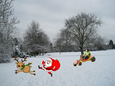
Flying a kite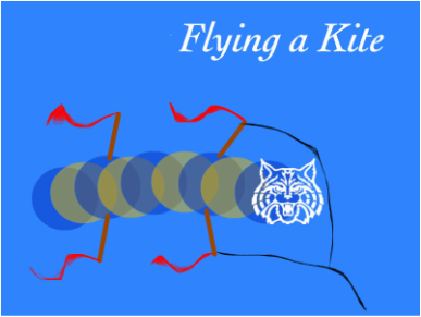
Survive!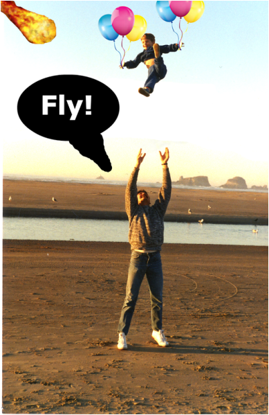
Carrot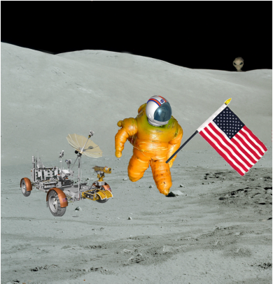
Chips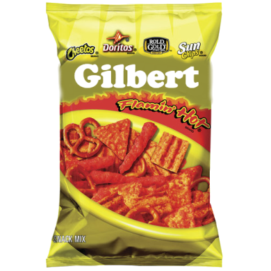
Car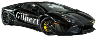
|
This image here was part of an assignment my teacher gave me. We were to remove the kid in the go kart and put him in another scenario or setting. He was first in a park but now he's chasing santa and his randier. So now he is on santa's naughty list which is the name of the file. The image was for a battle that we had done. I think the picture looks and makes sense. I'm pretty sure I could have added more to make it better but I think it is decent. I know I could have been better but it is what it is.
This picture is something that we had to copy to look exactly like a copy that my teacher made because he had a substitute. I think I had did a pretty good job with it, it does look like it. It actually looks pretty funny it's like circles with sticks and little red lines behind them. But I did like how the string turned out it looks pretty realistic to me. I really do not see anything needed to it besides fixing the circles on the flags to curve it some more.
This piece of work is a photoshop battle. The background the guy and the kid were already their. But I had to cut out the kid and put him higher up then I added balloons. I thought again that that didn't make sense to I added the thought bubble to make him say FLY!. Then I was like no lets make him escape from a disaster so I thought a meteor would be cool so he was trying to make the kid fly away from the meteor. You can probably notice the sky that I had to use this special tool called the stamper tool. It was very difficult to make that background right after taking the kid out of it. in the middle of that white and orange dust it looks too straight. But overall it was a cool piece of work.
In this picture we had this really weird carrot. It was another photoshop battle. It was like a super hero carrot on a desk with a hand holding it. It took me like an entire day to remove the background with all the different color's... So I thought it would be funny if I made him an astronaut so then I added the flag in his hand so he could plant it on the moon. But then I thought it would not make sense if he did not have a helmet because how would he breathe? Then I thought why not add a rover next to him. Lastly I was like what ever let's make it a bit funny and add a alien in the back it's kind of hidden but it is still funny.
This is a piece of work for an episode. It was one of my intro pic's. We had to choose our favorite chip bag and put our own name on it. What I did was put a whole new coat of color on the title then, I tried to get a similar font to the one I had already had it was difficult to find it though. But I think I chose the right color. White did stand out pretty well with the yellow, golden, and red. It fit pretty well. I mean the first thing I see is probably going to be my white name.
This picture was for an intro pic on an episode. We had to find a good car so that we can put our name on it. I chose a Lamborghini Aventador. Then I put my name on it which is Gilbert then I had got a curve which was pretty cool. That curve actually made it look like it was stuck on it. It looked like a normal car. I mean with all the little curves in the bottom it looks kind of ugly but they won't really notice it.
|
Elements of c.r.a.p
College & career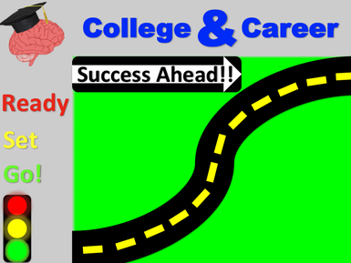
RHS FLyer |
My teacher taught us about this new thing called CRAP it stands for contrast, repetition, alignment, and also proximity. This project was based on it. It for some event called education celebration the was for a contest which was who ever students poster was the best it would be show cased at the event. I used the skill crap to make it look better. I think i'm glad with the work I made.
This is another project based on CRAP (contrast, repetition, alignment, and proximity.) This was a poster on this flyer that this school sent to my teacher. It looked very horrible no where near good. Everything was everywhere I had to put the information in a different way to make it look better. It was this yellow paper with pictures you could not even see, words that were everywhere, also the proximity was off, and pictures were at the wrong place. It was a mess but I made it look a little bit better than how it regularly was.
|